Posts

Digital Artwork: Plants overlooking the City
Image
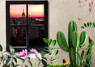
I recently started learning Adobe Photoshop and this was the first piece of digital art that I made on it. This piece is basically the digital equivalent of a collage/ mixed media artwork: all the elements in this composition - the window, wall, plants, etc. - were seperate photographs I gathered (most of them are from stock image sites Unsplash and Pixabay ) and combined together to create this. The concept for this painting came from me thinking about whether - in an alternate universe - nature could exist in its true, unadulterated form, looking at the industrialized, urbanized - basically destroyed - version of the earth where we live from afar. It was one of those weird ideas I often get. Nevertheless, I tried to translate that feeling into an image in this art piece.

Urdu Typography piece

Image
I have done a lot of experiments with Urdu typography/ hand-lettering but somehow all my attempts fall short of what I expect myself to create. This was probably my first successful attempt at hand-lettering in Urdu (and yes I understand the irony of that; Urdu being my first language). The concept and execution were both my original ideas, and I'm really happy with how this turned out. :) Any feedback/ critique would be more than welcome. :)

Collage: Online Identity vs. Identity IRL

Image
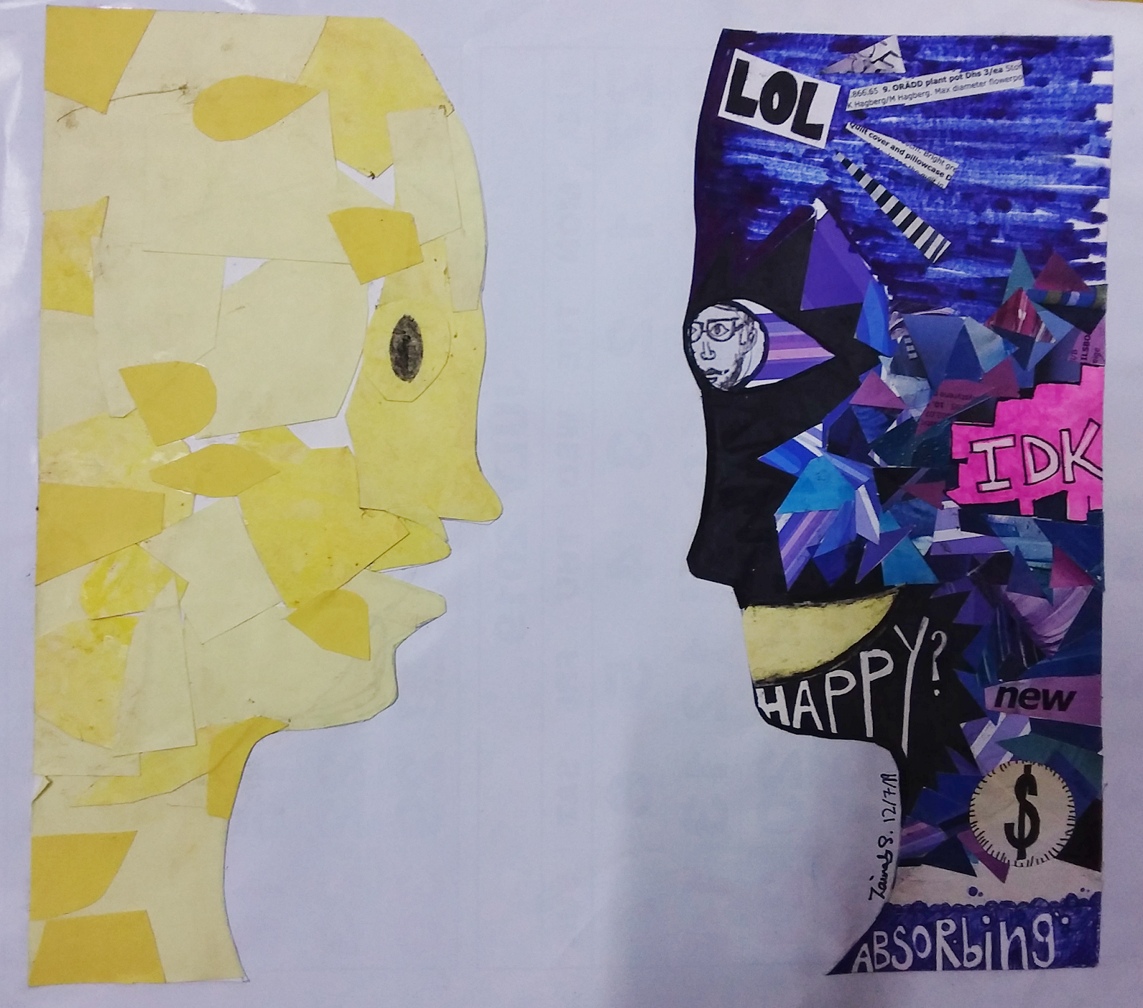
A couple of months ago I attended a two-week summer program at the Indus Valley School of Art and Architecture  in Karachi. The program was titled Crossover , and was aimed at students aged 15 and above. (My sister Fatima , who also attended these two courses alongside me and my brother , wrote a descriptive piece about the whole experience which you can check out here .) One of the assignments in the second week of the course - which was titled Media Crossings , and covered themes connected to social media, filmmaking and new media/post-internet art among others - was this thing which I am posting here. The task was to think about ourselves and our identities; both online as well as in real life, and then to create an art piece that acts as a portal between the two.  Although I don't think the piece I created does that very well (I think what I did made the contrast more obvious instead of bridging the difference), here's the result anyway. The face o

Light & Dark - an exploration of contrast through photography

Image
Last month, I attended a workshop titled ' The Basics of Photography ', held at ERDC . On the final day of the workshop, participants were supposed to give a presentation of photographs they took over the course of the workshop. We were free to present any of our photography, however, there was one important criteria: the photographs being presented must have some meaning, or tell a story. I loved the idea behind this assignment, and also the fact that we had absolute creative freedom for it. Although it was a bit difficult to come up with a theme for it (this wasn't part of the assignment, but I wanted my pictures to convey one message, so I felt it was necessary to have one), as there was so much I could do, but finally I decided on one theme: contrast. My presentation was titled ' Light & Dark: An exploration of visual and metaphorical contrast '. The idea for this was one that had occurred to me before as well, but I never managed to work on it. The

Ink Painting: Different Same

Image
Different Same , by Zainab Salman For several years, I have always been double-minded about using ink for anything . I write solely with fineliners, and never fountain pens, and use ink only when I feel a sudden urge to experiment with calligraphy or something that can only be carried out with ink. This is largely because of all my unpleasant experiences with ink, most of which end up with a wonderful piece of work ruined with blotches of ink all over. I have never known a medium that can be messier than ink. However, for this piece, I felt like I wanted to use ink. And gladly, the results were much better than my expectations. :D For this painting I used a compass (for the circle patterns), a grey fineliner, green ink and a reed pen.  The name of the painting, Different Same , has a lot to do with the meaning behind it. If you look closely, there is a lot of repetition in the design - all the shapes, although each slightly different in design and size, are essentially t

Sketches Galore

Image
Hey there! I've been inactive for quite a long time, but I'm back now. :) This post contains sketches I've been making all this while, mostly pen. Those of you who have been following my blog probably know my preference for using pens over pencils for sketching. Something I love drawing: my hands and feet. I used to draw hands a lot but recently I realized that it had been a long time since I last did that. not bad, eh? I'm definitely NOT a natural. :p my sketchbooks are filled with lots of failed sketches like this one, lol. when you're bored during a workshop... I don't often get the opportunity to draw people; largely because no one sits still long enough to be sketched. However, sometimes I do doodle people during programs etc. when no one is looking. ;D  I drew these random people while waiting at an airport lounge with nothing else to do. I guess it isn't very ethical to stare at people while you're drawing them (o

Untitled Digital Painting

Image
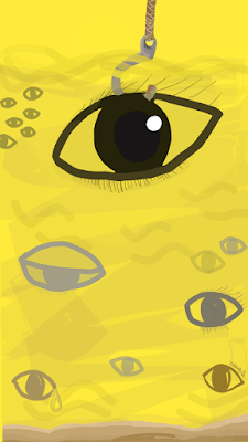
This is a painting I made digitally. This is one of the first good pieces of digital art I've made in a long time. Although I'm reasonably good at graphic designing and I'm not that bad at drawing traditionally either, I really do suck at digital art. Anyway, this is one of the not-so-bad ones, something I made fairly recently. I honestly don't have much to say about this. I'm sure this has some sort of 'meaning' behind it but I'm not sure what exactly. So I'm going to leave it to you to work out what it means, do let me know in the comments. xD Untitled digital painting

A pen, a journal and the mountains

Image
Long time, no post, I know . :/ I've been busy but I hope to be active on this blog once more. :) Here are some pen sketches which I made in Kashmir (on a trip to Sharda; Neelum Valley). I have been meaning to post these for more than a month but procrastination always gets in the way. :/ Kashmir was a wonderful place, definitely one of the most beautiful places I've been to. We got a chance to explore the place, and to absorb in the sights, sounds and smells of nature. These sketches (some reasonably refined, others quite unfinished) are an exploration of the natural beauty of the valley. Unfortunately (and contrary to the title of this post) I couldn't sketch any of the mountains. They just seemed too huge in their size, and too varied in their features and I really doubted I could capture the landscape with my pen and paper, although I do wish I had at least made an attempt to sketch them. But I did make sketches of other things. :) Here they are. This one was the

Hand-lettered Quotes

Image
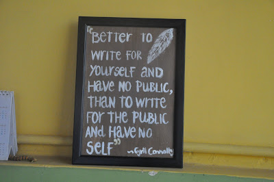
One of the things I   enjoy doing most is typography/ hand-lettering. It is something that I'm doing very often, and most of the time, I'm doing it instinctively. Luckily, I don't even need any fancy materials for it. Most of the time; I simply use these black pointers by a local company but once I also got a Staedtlar Triplus Fineliner  (and hey, these are not   affiliate links! ;D) and that lasted longer. Anyhow, here are some quotes I read somewhere and really liked, so I typograph-ed them. (I know typography is a noun but because I do it so much, I really think it should be a verb as well as a noun. :D). This quote by Cyril Connolly is one of my all-time favorites. It currently hangs in our study space, to remind us something very important. :) "Better to write for ourselves and have no public, than to write for the public and have no self." -Cyril Connolly (click on this for a closer look) I made this one with brown and white acrylic paints on c

Sketching the Ordinary - More pen sketches

Image
I have seen artists who sketch or draw special, unusual stuff only, but then maybe sketching is something very special for them. For me though, sketching is something very habitual and everyday; kind of like an exercise I try to do regularly, just to keep myself in shape. Thus the subjects of my drawings are also everyday objects - you are unlikely to find in my sketchbook a sketch of a pretty vase of roses but you are very likely to find a drawing of a pile of books or a cluttered table. I also tend to sketch  with pens rather than pencils  because then I can't erase or keep on trying to make my lines straight; I simply   draw , without criticizing my own work. While I'm drawing with pens, I am not expecting perfect end-results; instead, I am simply enjoying the journey, and am more at peace with myself. So here are some more pen-sketches. Although I have mainly used black fineliner pens instead of coloured ones, I have used coloured highlighter markers (one of my all-tim